D is for Doris.

A conceptual Szechuan hot pot restaurant brand aiming at young,
metropolitan customers. Focusing on the distinctive flavors and major spices used in cooking, the
visual identity connects the cuisine’s unique recipe and the customers’ senses, highlighting its authentic flavor with a groovy style.
The brand is named with an “A” (”啊”) in the fourth tone, the simplest yet boldest exclamation in Chinese.
The brand is named with an “A” (”啊”) in the fourth tone, the simplest yet boldest exclamation in Chinese.
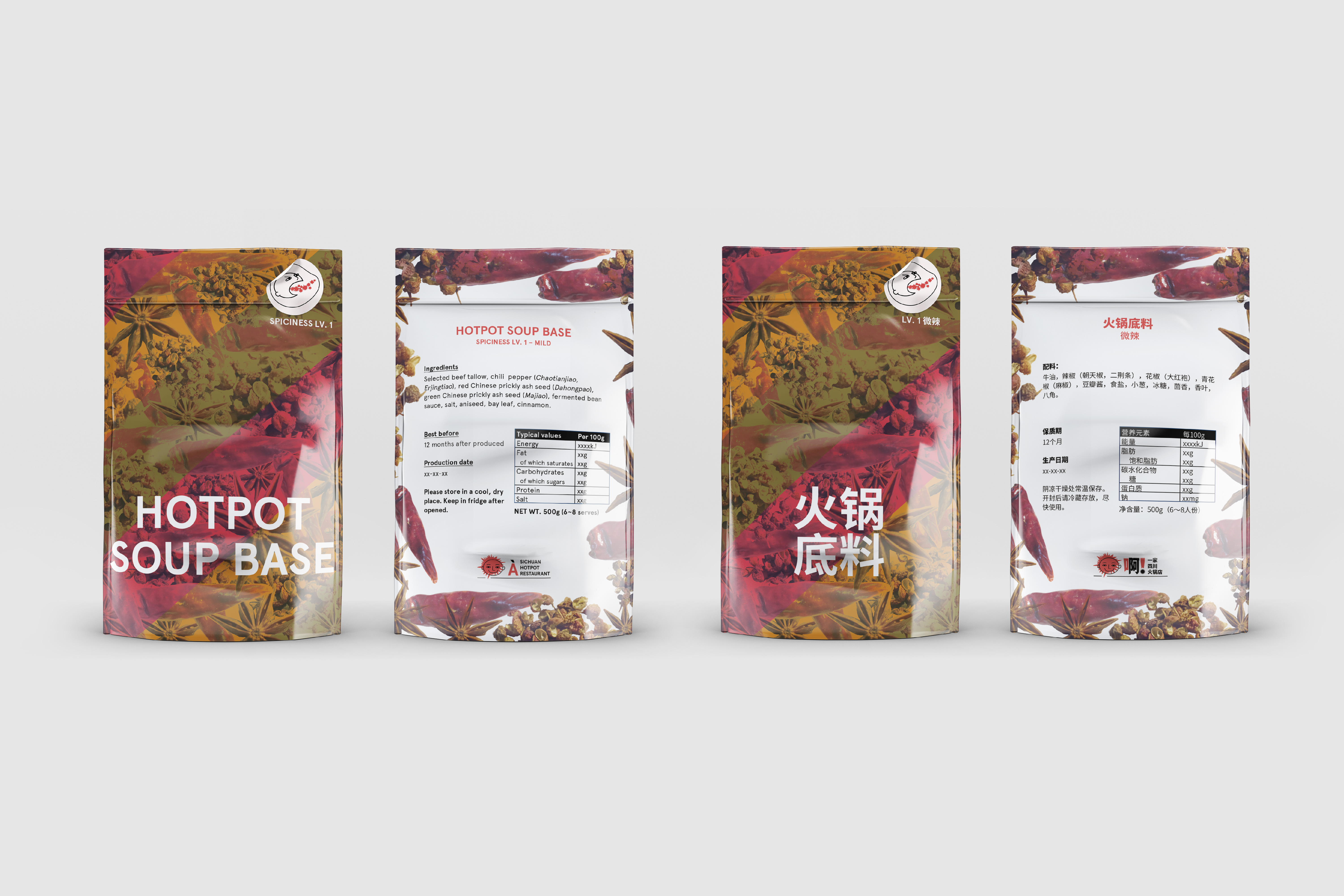
Dried red chili, Sichuan peppercorn and anise are three crucial ingredients in the recipe of authentic hot pot soup base. Their fusion and reciprocity result in the complex and addictive flavor and aroma of the hot pot.
Three secondary colors are drawn from these spices to complement visual interest of the brand.